

In today’s attention economy, who we are and how we appear are vitally important to make sure we can be heard and stand out from the crowd. That’s why Rally has always believed an organisation’s story and visual identity is fundamental to the success of any programme to mobilise the public at scale.
We’ve run organisational story and visual identity projects with a number of clients including Refuge, Praxis and Switchboard as part of our digital mobilisation strategy work with them. It’s not a part of our work we talk about enough. So we’re putting that right by sharing our recent work with SOS UK.
The strategic need to mobilise public support
SOS UK (Students Organising for Sustainability UK) works with students to campaign for a greener, fairer world, transforming education so people protect the climate and nature. At a critical moment in their organisational development they recognised they needed to engage the public at scale to drive mission success and help secure the organisation’s sustainability.
Until that point SOS UK had been happy to sit in the background and be the support crew to the young activists. But it was clear this approach would not attract the scale of support SOS UK needed to support its growing ambition. Nor would it fulfil SOS UK’s strategic objective to deliver its vision by mobilising collective change.
But SOS UK’s strategy needed greater clarity as to how the public was to play a part in creating this change. So SOS UK approached Rally to develop a digital mobilisation framework around which to base future activity to increase public engagement and therefore deliver growth: more reach, action, influence, income and impact.
A story, voice and visuals to inspire action
A key area of focus the framework identified was to develop a simple, inspiring and consistent story to articulate how the public can actively participate in the vision and give a share of their time, money and voice to achieve the system change SOS UK wants to create.
The story needed to explain SOS UK’s role in student-led activities and be conveyed in a voice and style that inspires participation. SOS UK also needed a visual ID to support the story by driving engagement and action and reflect the vibrancy of student initiatives.
The big challenge was how to balance the SOS UK story with that of each public facing youth-led campaign in a way that complements and amplifies youth-led activity rather than dominates it. This meant a solution that told the SOS UK story as an enabler of youth activism and created unified brand elements and co-branding guidelines to tie the SOS UK family together along with ways to enable reciprocal amplification.
Working in a different way
When we set up Rally we wanted to create a new way of working, focussed on collaboration and partnership. We’re proud to be different and not to fit into the conventional agency box.
Our work with SOS UK is a great example of how this collaborative approach delivers the flexibility to work with clients in ways that work for them. If needed, we bring in associates with the expertise to deliver key elements of the framework who are a perfect fit for the task. This brings speed, value for money and flexibility compared to full service agencies and, with Rally at the heart, keeps strategic continuity and focus in the wider mobilisation context.
“Working with Rally was easy and gave us the expert guidance we needed. They worked directly with our team, really getting to know and understand the charity and creating a bespoke package. This meant we got the flexibility and value for money that is so important for a mid-size charity, whilst getting high quality support and expertise.”
Meet India and Josie! We’ve worked with India many times over the last 4 years because she’s a leading digital mobilisation and storytelling expert who excels in delivering game changing narratives and strategies that inspire action. Josie is a fantastic freelance Creative Director with loads of experience in radical and movement circles. We’d wanted to work with Josie for some time so were excited to make this our first collaboration.
What we say, how we say it and how we look matters
Stories connect us with our values and emotions and make us feel part of a community and inspire us to act. Creating and consistently telling the SOS UK story will help others build a deeper connection with the organisation. How we present our story matters too - in a more vibrant and responsive way, to reflect the energy of both SOS UK and the student-led initiatives.
The project had 4 deliverables: a compelling story, clarity of voice, visual ID and co-branding guidance. All brought together in a practical toolkit so can be used easily and consistently.
To develop the work, Rally, India and Josie all worked with the SOS UK team in a collaborative way, using interviews and a workshop to get a real sense of who SOS UK is and what it needs as well as to gain alignment on a clear direction we could take. Once we’d come up with various creative treatments, we conducted focus groups to get direct feedback from the people we needed to inspire. Finally, we presented drafts to the senior team who collated feedback from around the organisation to enable us to finalise the work with total buy in.
“We partner with students to make amazing things happen, that they couldn’t do without us and we couldn’t do without them”
This quote from the workshop stood out as we think it positions SOS UK as key, important and impactful without taking any of the credit away from the young people doing the work. It became a cornerstone and inspiration for the work.
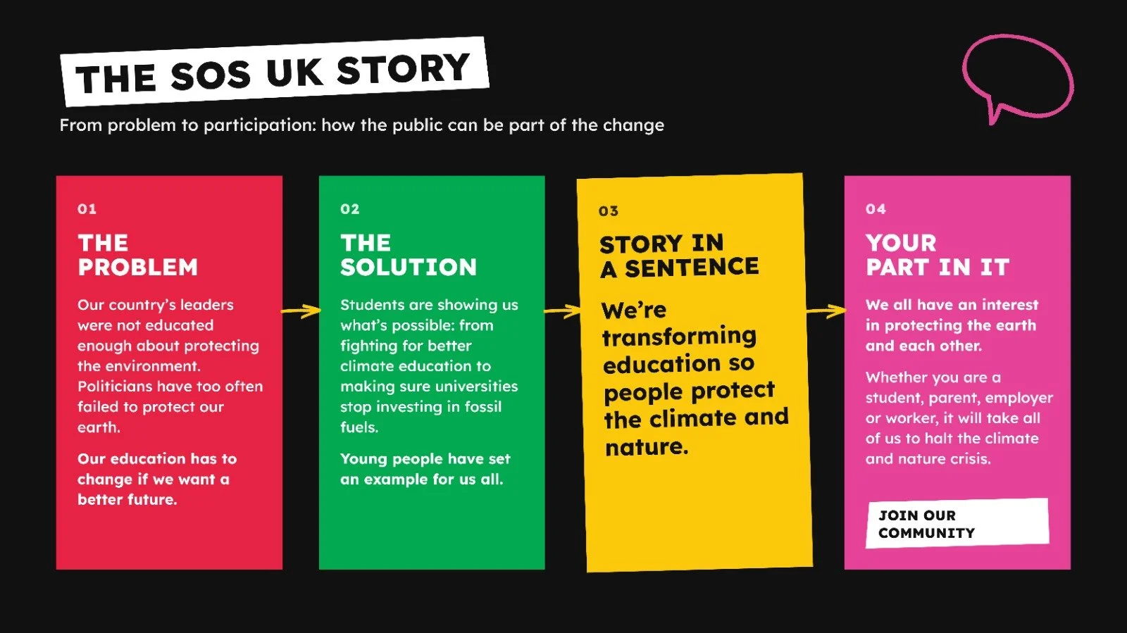
A story sets the powerful narrative to attract public support: it defines the plan to achieve change, names the heroes, villains and potential blockers and articulates the role of supporters to help you win.
For SOS UK we defined the problem and solution it's working on as well as a public facing vision to show the public exactly what it’s doing. These formed the basis for the SOS UK story which led us to a supporter theory of change to inspire active participation.
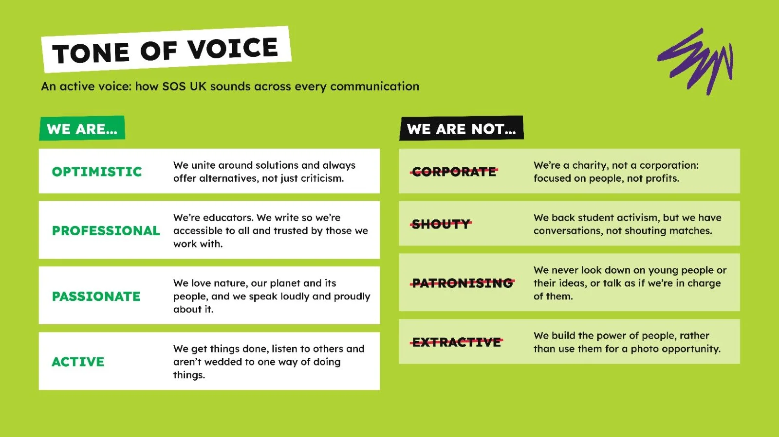
It’s not just what we say, but how we say it. India also developed a tone of voice - how we express our brand personality consistently across all communications - and brand attributes to be clear on how SOS UK sounds, giving more detail against each characteristic.
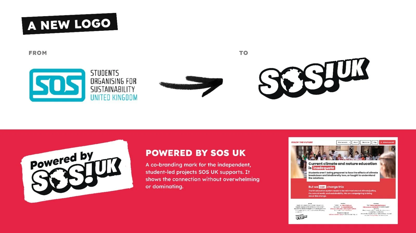
Josie developed a new visual ID to work with the story and tone and support the drive to attract the public at scale and SOS UK’s mission of student empowerment and action. This wasn’t just about looking good or cool or radical. It was about creating a system that is simple to use and inspires engagement and action.
A new logo was created: the world icon at the centre, just as it’s centred in SOS UK’s ethos, a community of students and their supporters building a world where the climate and nature is protected. And a new co-branding approach: ‘Powered by SOS UK’ which puts a mark on independent projects SOS UK is supporting in a way that doesn’t overwhelm or dominate.
Alongside this, a new colour palette full of bold and vibrant colours that gives choice depending on audience and content style and a new typeface which is accessible, legible, free and impactful. Josie also created hand drawn assets (e.g. arrows, call outs) to help focus attention on key messages, guide users through content and add emphasis where needed. Finally a style guide for photography so images don't just show what SOS UK does - they invite others to see themselves as part of the movement.
Bringing it all together
When all the elements come together they create something greater than the sum of their parts. The consistency builds trust and recognition. But it’s more than just consistent branding, it's a dynamic visual storytelling approach that drives real action. Everything speaks the same visual language and carries the mission forward.
The transformation is incredible.
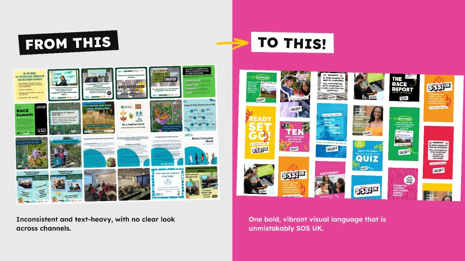
The system is flexible yet structured. Teams can be bold and creative while maintaining that unmistakable SOS UK identity. Whether it's a social media campaign, an institutional presentation, or a student-led initiative, the message lands with impact every time.
When people see these visuals, they instantly know they're being invited to be part of a movement that's making real change happen. They recognize not just the logo, but the energy and purpose behind it. It’s a system that doesn't just look good, it works hard. It engages, it motivates, and it converts passive observers into active participants in SOS UK.
Putting it into action
The SOS UK team is empowered to use the brand confidently thanks to the toolkit prepared by India and Josie which brings all the key elements together.
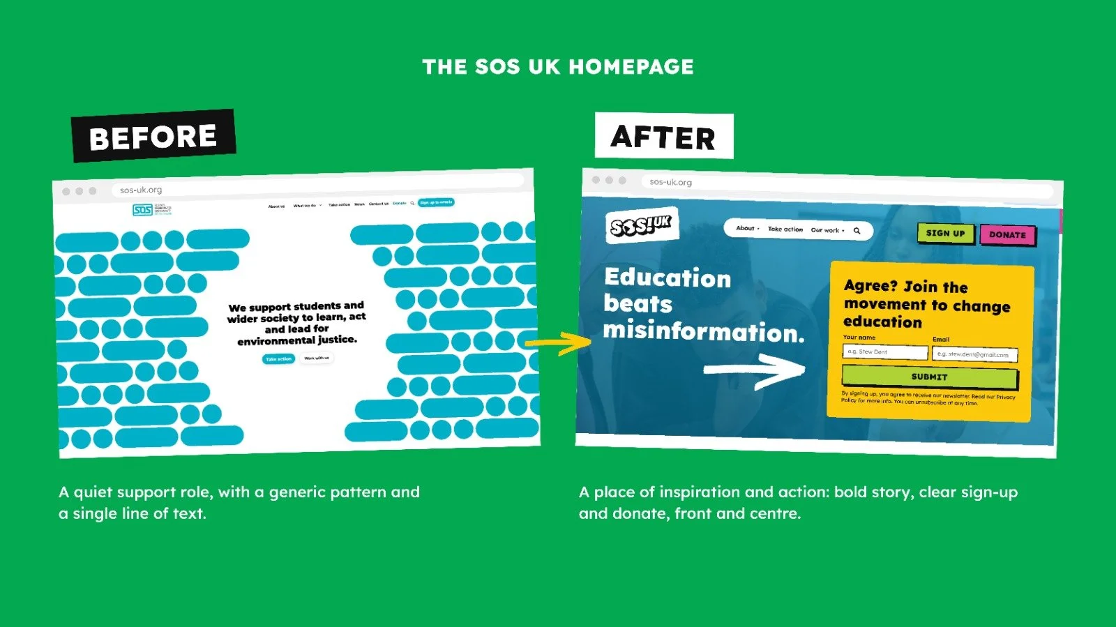
The first thing the SOS UK team has focused on is to update their social channels and website with the new approach. As you can see the homepage has been transformed into a place of inspiration and action.
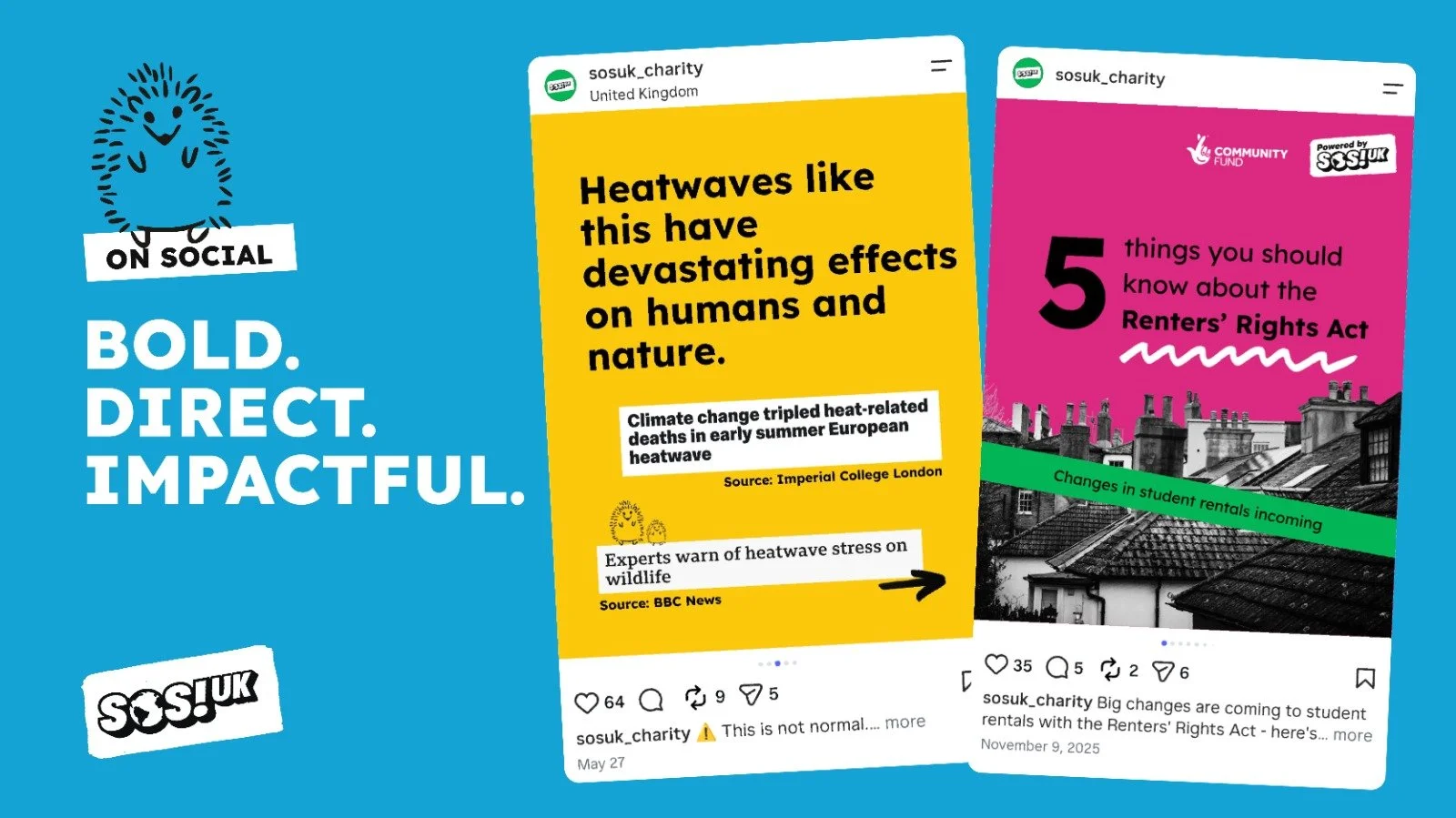
While social posts are bold, direct and impactful.
The new story, tone of voice and visual ID have enabled SOS UK to move forward with their digital mobilisation programme, equipping them with the tools to attract the public at scale. They have transformed SOS UK’s ability to communicate and inspire active participation and the energy and vibrancy matches the passion of the student initiatives.
“The toolkit is super easy to use and works for everyone from external content professionals to our internal programme experts. That’s so important in a small, busy organisation like ours because it helps us produce inspiring communications efficiently and effectively. Our new brand gives us a coherent, vibrant look and passionate voice that reflect who we are and what we stand for, something we really needed to help us activate new supporters and build our community.”
We would love to do more of this work. If you're interested in finding out more, get in touch.